Background
At Advanced Blockchain, a Frankfurt-listed company, I was one of 12 designers, and as a senior product designer I owned Pablo’s swap screen. We shipped Pablo, a decentralised exchange, and Trustless, a tool for moving assets between blockchains, both on Composable Finance.
I also helped set up the company’s design rituals, and coached a newer designer on another team. She had good ideas and no story to tell them with, so I asked questions until she found one, instead of presenting for her.
What’s the impact?
- The swap screen shipped with the outcome first and the detail just below it
- Feedback was that it felt simpler than other swaps
What’s the problem?
A swap screen has to answer two questions for two kinds of people. Most people want to know what they’ll get and what it costs. Experienced traders also want to see how the trade will execute before they trust it.
Challenges
- Simplicity and inspection pulled in opposite directions. Every line of execution detail competes with the outcome.
- The design lead had better business context. Experienced traders inspect how a trade executes, and they’re the ones who pay first.
- Crypto amounts are hard to read. “2,000 DOT” means little until you know what it’s worth.
What did we ship?
I went minimal first. The card showed the rate on one line, and everything else sat behind an expand: what you’d get after fees, how much your trade would move the price, the fee, and the route between chains.
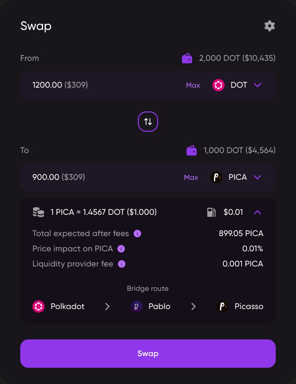
The design lead wanted the detail visible. I took both versions to design critique and walked the same swap through each.
- Good: The cleanest screen
- Good: What you get and what it costs, first
- Not so good: Hides how the trade executes, which experienced traders check first
- Good: People who just want to swap read the top
- Good: People who check execution find it right underneath
- Not so good: Some of the first version's simplicity
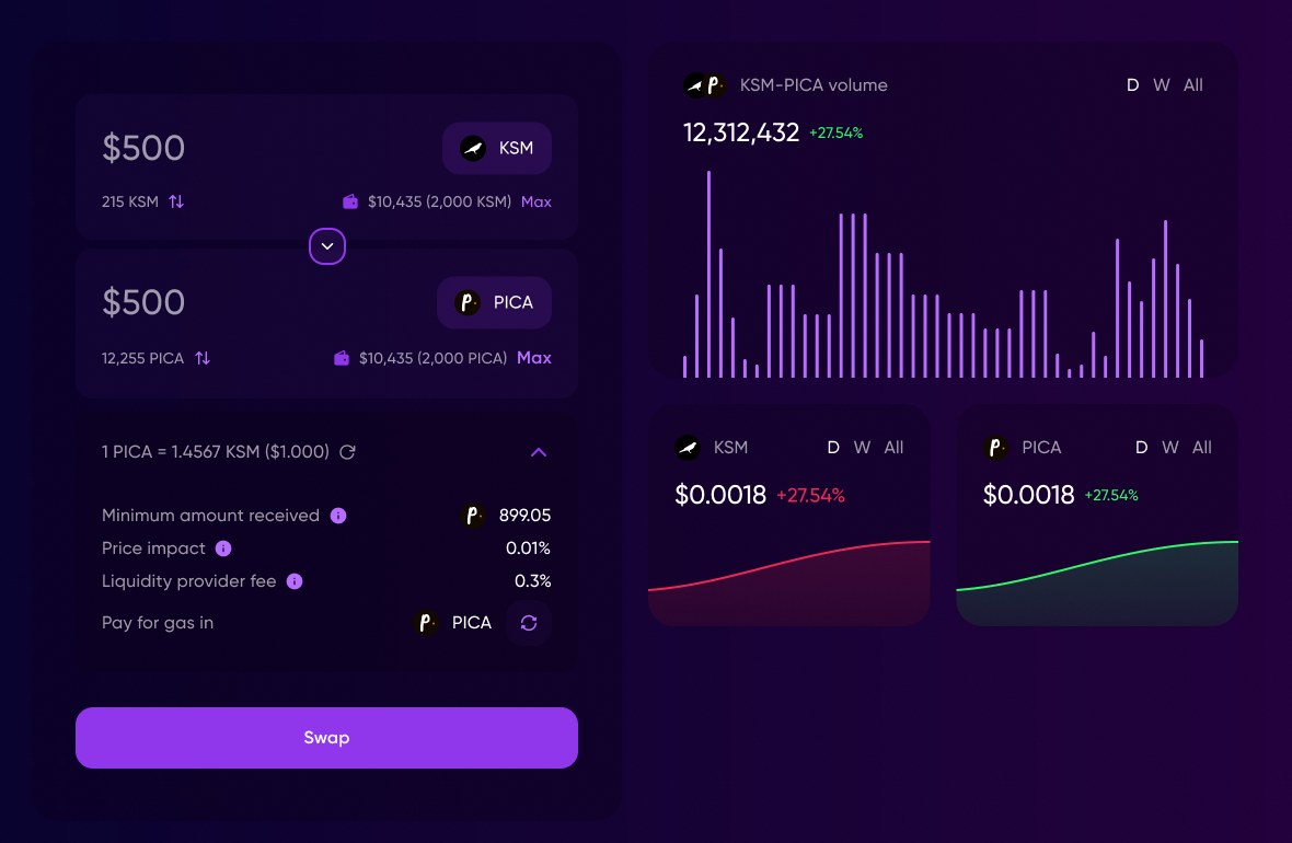
The design lead’s point held. The final screens changed in other ways too:
- Dollars first. You type “$500” and see the token amount underneath, with a toggle to flip them.
- A floor, not an estimate. “Total expected after fees” became “Minimum amount received”, the least you’ll get if the price moves.
- The fee as a percentage, not a token amount.
- Market charts beside the swap, so you can check the price without leaving.
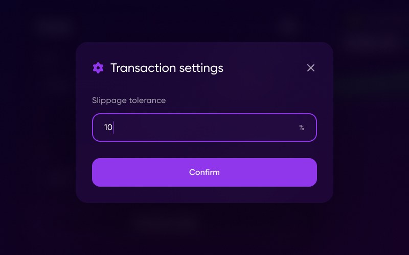
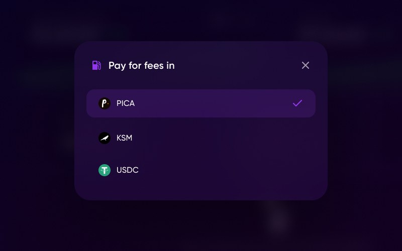
Two choices stayed in small sheets: your slippage tolerance, and which token pays the network fee. Paying gas in a token you already hold means you don’t need to buy one first. When something would fail, like a price impact that’s too high or a balance that’s too low, the Swap button says so instead of letting you try.
How did we do?
Feedback was that it felt simpler than other swaps. I don’t have a number that isolates the design. The launch volume was the protocol’s, not mine.
Takeaways
- Once I saw the design lead was protecting the traders who pay first, walking one swap through both versions settled it. Find what a senior person is protecting before you argue, then let the comparison make the case.
- Hiding the detail made the screen cleaner, but it hid what experienced traders check first. Keep the information and change its prominence: the answer first, the detail just below.
- Most people think about money in dollars, not tokens. Show amounts in the unit people already think in.