Kora: Simplified payments for buisnesses
Feb 2020-Jan 2022
Kora aims to create a world void of digital financial barriers across Africa through a unified platform offering diverse payment solutions. Focusing on fund collection, disbursement, and settlement, Kora's core product is a payment modal.

Team
Kora 🇳🇬
Worked hybrid as a product designer for the merchant team.
Platform
Web
My Contributions
Branding, Information architecture design, Visual design, prototyping, Interaction design
Starting from scratch
Kora offers several business finance solutions, including its payment modal and virtual accounts. The company has to lose some of its brand equity amongst new customers to startups like Paystack and Flutterwave.
My primary responsibility at Kora was to design the Korapay merchant dashboard — a payment processing and tracking tool now used by thousands of merchants across Africa.
As any merchant who has ever used QTB knows, it can be quite difficult to set up. However, once you have it figured out, you can run your business with the lowest fees in the market. In a saturated marketplace with a growing list of enticing alternatives, most merchants are less willing to put in that effort, so it was time for QTB to adapt to meet their needs.
Design goals
Design Kora Merchant in collaboration with the product and development team, as part of a larger suite of Kora products, to help the company get ahead of the curve amid existing competition from startups in the market.
Outcome
We built a more intuitive product, eliminating several onboarding bottlenecks and helped merchants set up shop quicker. Within the first year of the relaunch (2021-2022) quickteller business recorded a 35% increase in sign up rates with over 40K new merchants in the first year.
Gathering context
Kora gathering workshop (March 2020)
The outcome of my preliminary workshops & research, and the defining hypothesis of the design was that; by enabling merchants onboard quickly and making the application intuitive, we would meet or improve 78% of merchants’ needs. This was validated using merchant interviews and data analysis by the product team before, during, and after the dashboard design. The participants of the usability report included businesses like:
Kasai Clothing – Individual Account
Shutterscore – Small Business
Quidax - Medium Business
Binance – Large Business
We intended to rebuild the portal to work for the merchant and not the other way round. This way it would remain easy to use regardless of the size of your business.
Design principles
Minimalistic, to highlight the actual content and not the container; Simple yet sophisticated, in terms of look and feel. We laid the foundations for the colours, typography, and style.
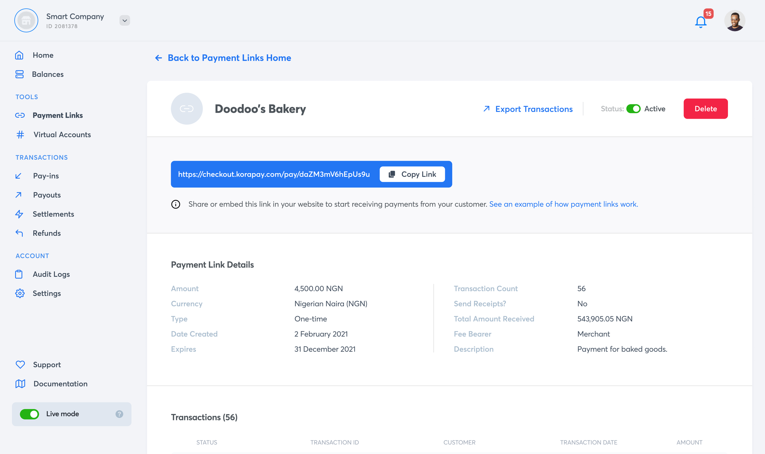
Managing payment links details page
Transaction details page
We aimed to make the product simple for merchants, but we also added a host of new features as the design process went on users now expect so we improved iteratively. Examples of these features include virtual accounts and improved control with payment links (which were already available with Paystack and Flutterwave). The main challenge was to keep Kora user-friendly for smaller merchants while not removing the features that larger organizations appreciate.
Prototyping
The subtle movements made the product feel more alive, making it easier to use and show when things worked or didn't. Shadows were also important for showing the depth of content and giving feedback to users throughout the app.
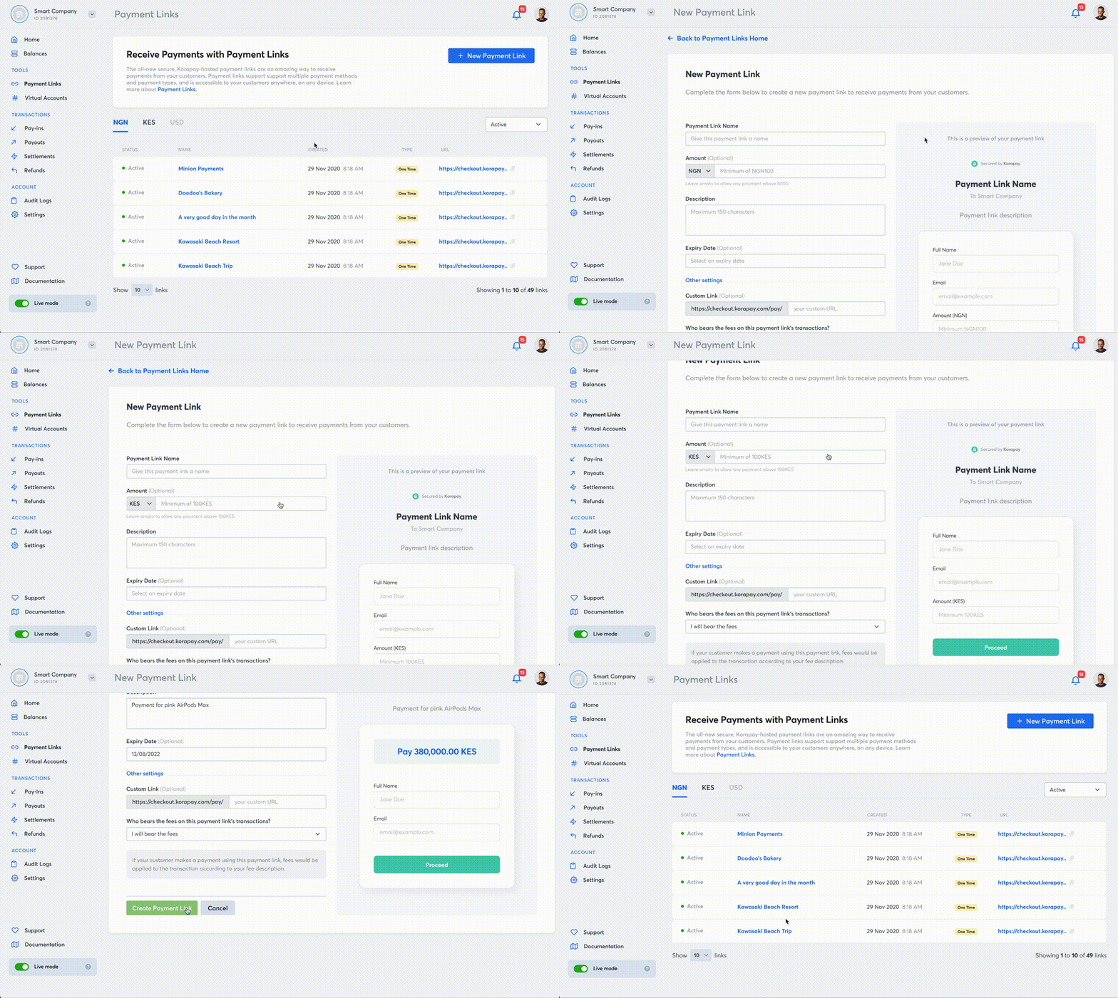
Prototype: Creating a new payment link
Conclusion
This project was significant for me, and I'm excited to have had the chance to learn, make mistakes, and solve problems. I gained a deeper understanding of payment processes, the requirements of various merchants, and how to strike a balance between satisfying both the client and the customer in the B2B industry.


