Optimising the payment experience
Jul 2021 - Jan 2022
Kora aims to create a world void of digital financial barriers across Africa through a unified platform offering diverse payment solutions. Focusing on fund collection, disbursement, and settlement, Kora's core product is a payment modal.

Team
Kora 🇳🇬
Worked hybrid as the product designer on the payment checkout.
Platform
Web
Mobile
My Contributions
Information architecture design, Visual design, prototyping, Interaction design
The challenge
Kora had a payment system for 6 months that only accepted bank transfers. Over a million people tried it, and we successfully completed 38% of transactions. We wanted to add card payments, but we had to fix our declining success rate. We didn't have much time or resources, but we were allowed to experiment and think creatively.
Design goals
Through Mixpanel data and customer feedback, product, and design collated information, and some of the following were required to be improved:
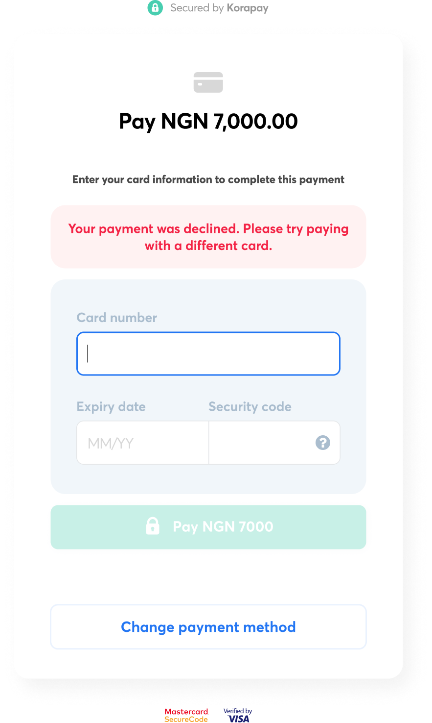
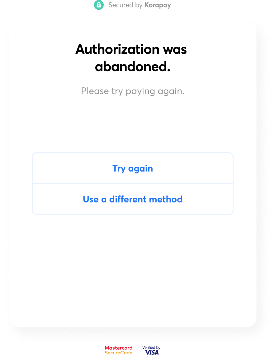
Improve payment status clarity and feedback
Simplify account and transaction management.
Outcome
After polling, we discovered scenario 1 as the preferred option. Its implementation promptly decreased failed transactions, elevating the success rate from 38% to 59%+. Consequently, the redesign generated $100M+ in revenue from Gross Transaction Value, showcasing the value of our user-focused solutions and collaborative design approach.
Research
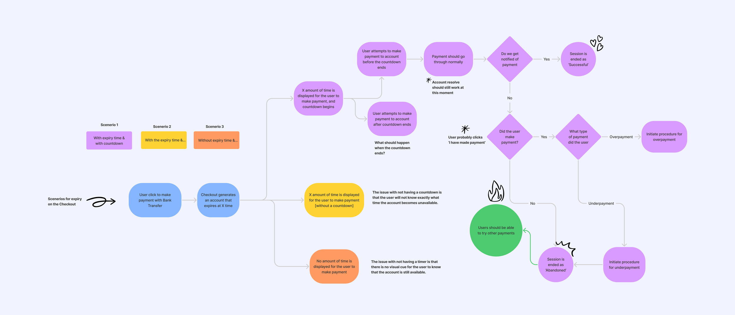
I discovered that customers can't finish transactions when they click the "I have paid" button. This occurs because the payment status tool clashes with other systems and needs manual fixing instead of automation. Moreover, customers find it hard to grasp the information on the screen, missing key details like the time left for the transaction and the option to make a single transfer. To understand the problem better, I used Figma's whiteboard tool, Fig-jam, to create different flows for the main scenarios customers are going through.
Userflow of 3 possible solution scenarios
High-fi wireframing & testing
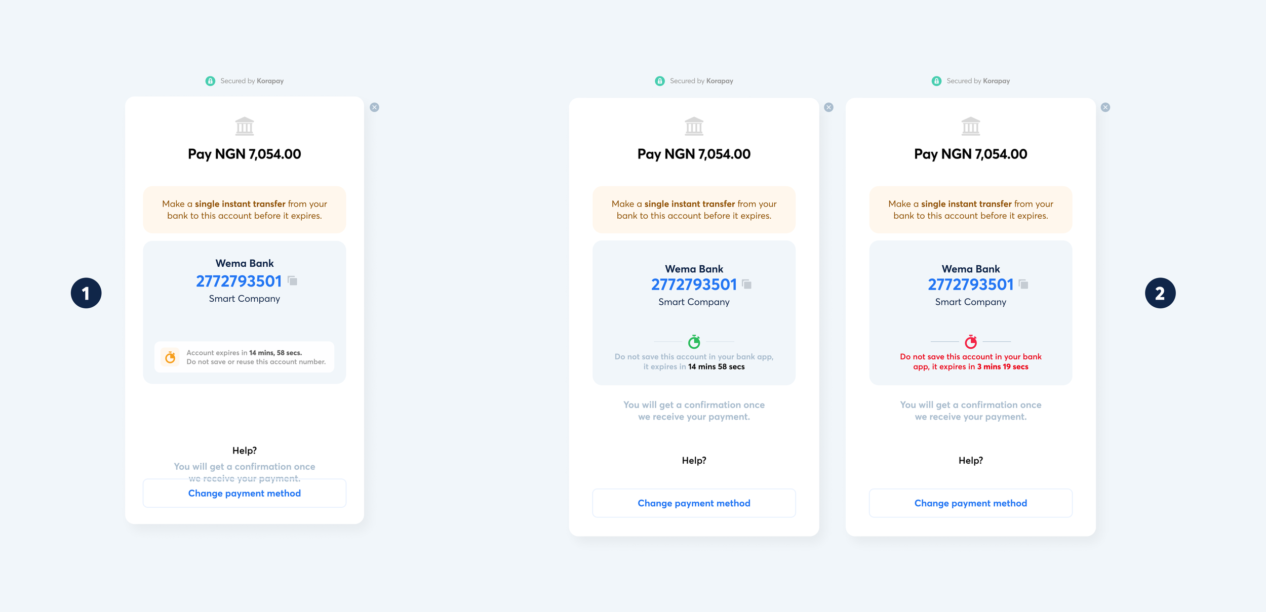
Considering we already had the components in high-fi; Nnamdi and I collaborated on figuring out all the possible ways we could fix these issues and settle on two primary flows and went ahead to test amongst colleagues and a few customers.
Scenario 1: Keeping the confirmation button, but improving the flow around managing when a user clicks the button.
Pros
Gives the user more control and involvement in the process.
Has suitable checks and alerts at every point
Cons
The different things occurring at different points of the checkout could make the entire process 2-3x more clunkier.
Scenario 2: Removing the confirmation button, which means less clicks distracting users from the primary objective.
Pros
More straightforward flow with less control and expectations from the user.
Easy to understand and cuts the possible amount of clicks by about 72%
Cons
User may be in a rush to click need help if they send the money and do not notice the loader that pops up indicating that we're watching out for the transaction.
High fidelity mockups
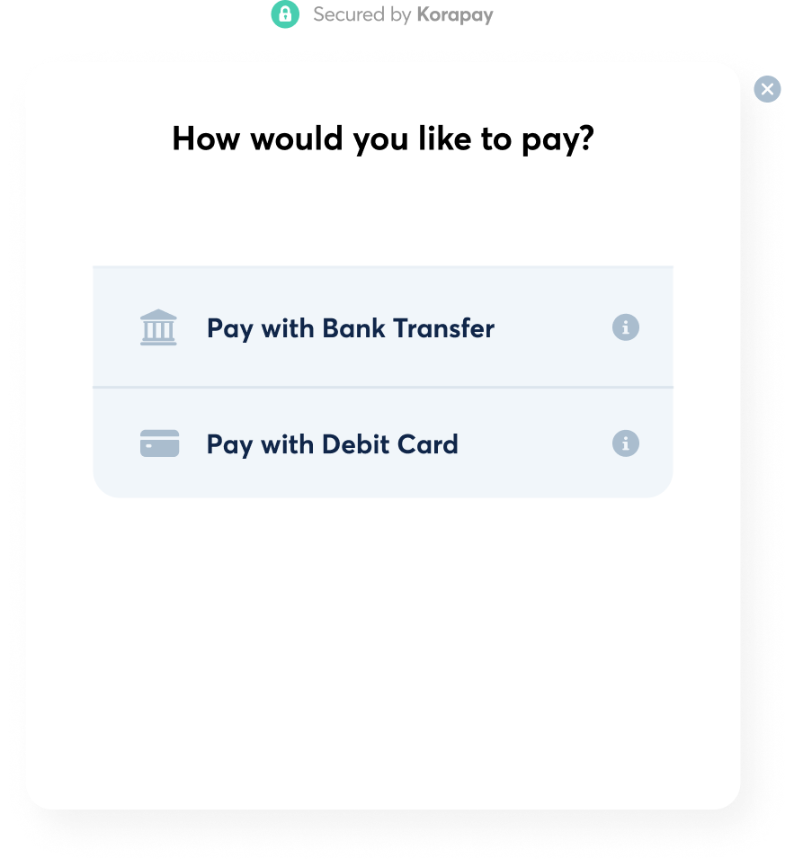
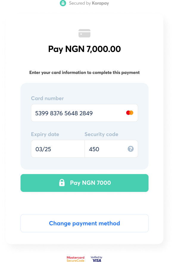
I improved the way bank transfer works by making it clearer which payment methods are available. I made some changes to the company logo and font to help users understand the process better, particularly when it comes to the expiry section. Instead of completely redesigning everything, we made small improvements to the user experience over time to avoid confusing our users.
Other less obvious updates included minor optimisation with regard to the spacing between elements on the cards to make the layout cleaner and the view easier to use.
Prototyping
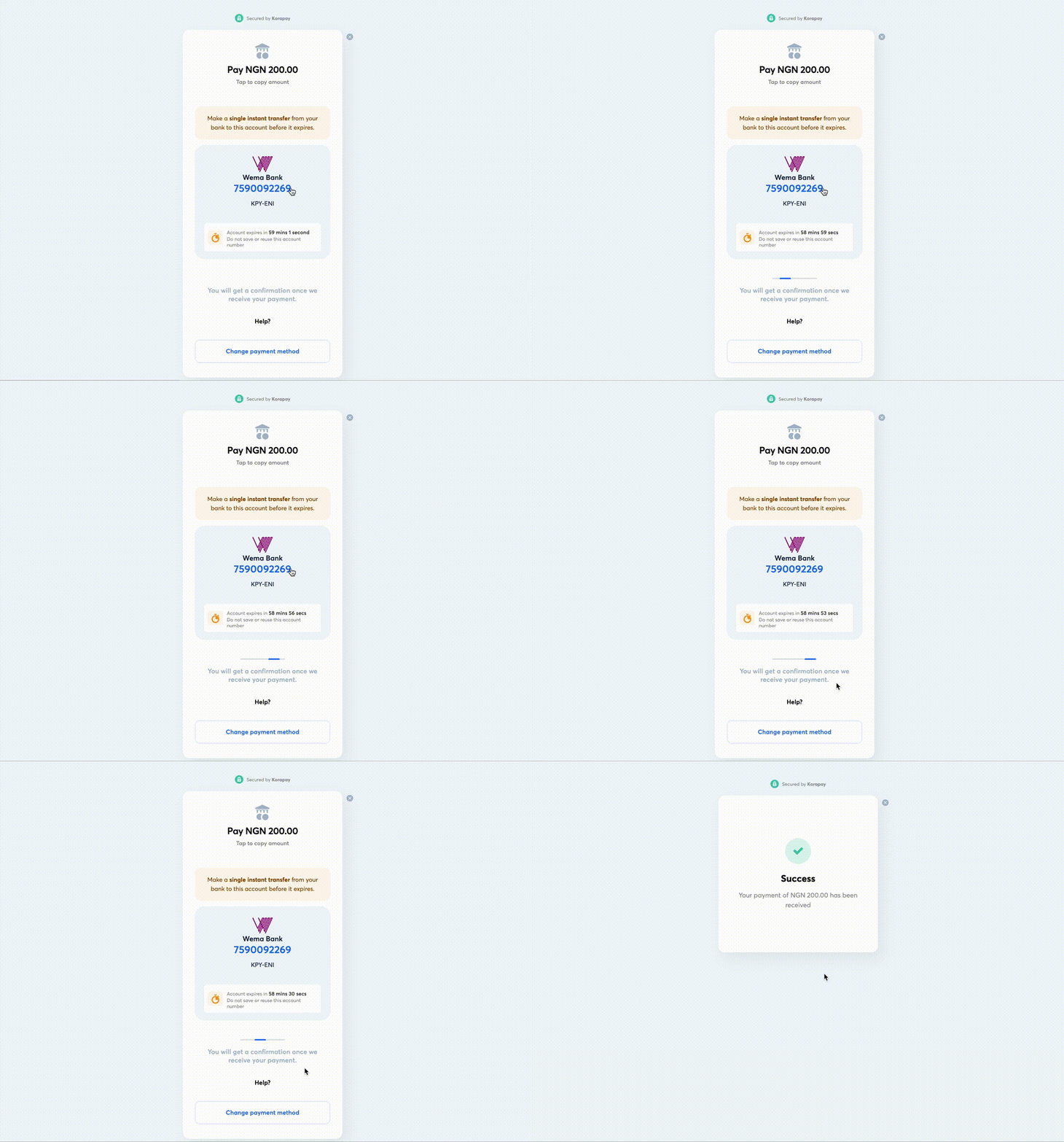
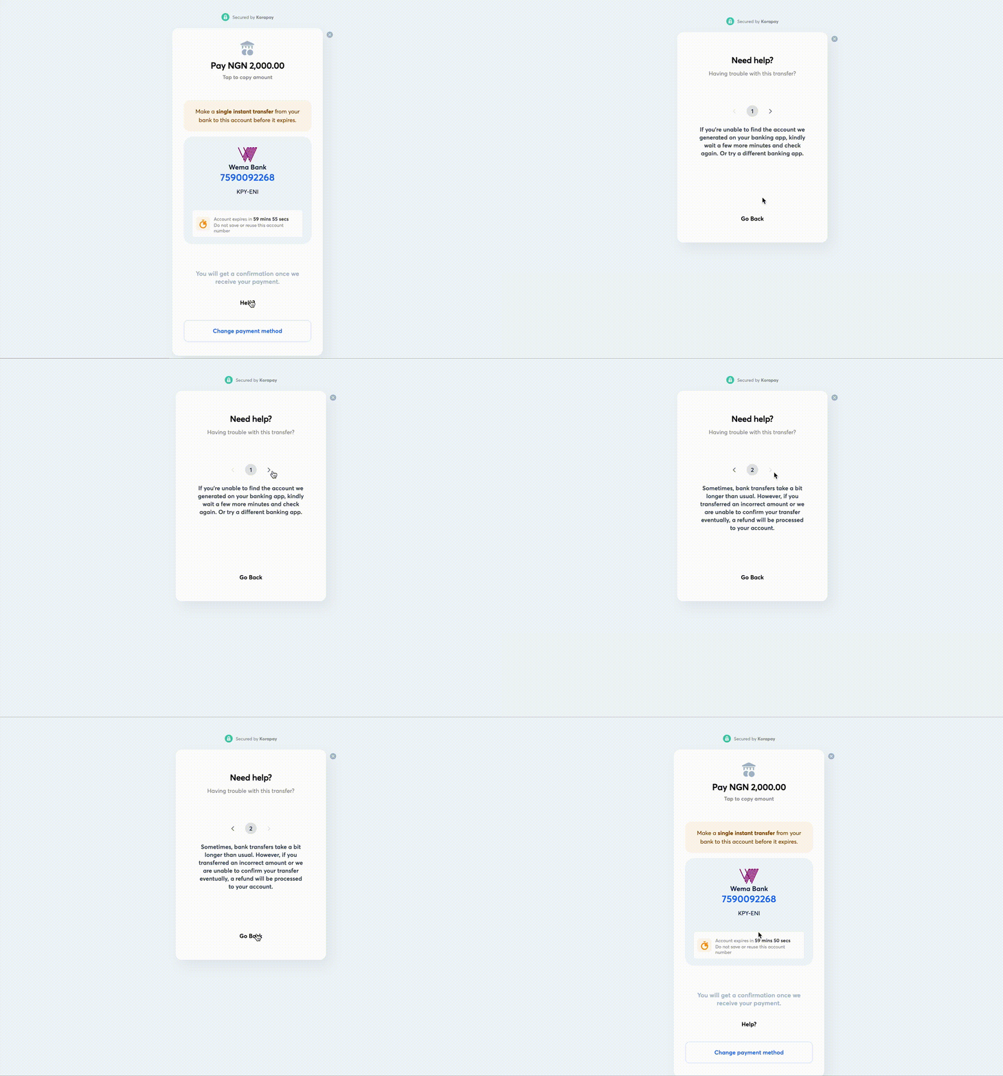
Prototyping was essential for this project. Our goal was to improve the overall user experience by adding small movements that made the product more dynamic and easier to use. These movements also helped users see if they were successful or not.
Prototyping: loader to wait for successful transactions
Prototyping: Help Navigation


