Improving the onboarding process for an offline app.
June 2022
Stax is a financial services app that enables users to manage their finances with ease. The app allows users to link all their bank and mobile accounts, send money, buy airtime, and check account balances and transaction history.

Team
Hover Dev. Services 🇺🇸
Worked remotely as the product designer on the onboarding and redesign of the app.
Platform
Android
My contributions
Information architecture design, Visual design, prototyping, Interaction design
Problem statement
Despite its innovative features and convenience, Stax users were experiencing difficulties during the onboarding process due to complex and unclear permissions flow, leading to a high drop-off rate of 35% between downloading the app and granting overlay permissions. This issue negatively impacts the overall user experience and results in low activation rates (18%).
Design goals
The project's goal was to: Understand the problem and identify issues in the process of onboarding and managing permissions. Develop practical ideas to make it easier for users. Build trust by clarifying the permissions process. Keep users engaged with a modern and appealing design.
Outcome
We simplified the sign-up process to reduce the number of people who quit before completing it and made it easier to do things like send money or buy airtime, leading to an activation rate increase from 18% to 30%. After week 1, retention increased from 8% to 24%. and after month 1, retention increased from 4% to 15%.
I conducted a series of interviews with various users, mostly from the Nigerian market to understand their experiences with the onboarding process and identify friction points. Key takeaways from the interviews included:
Users felt overwhelmed by the permissions requests (4) and it's complexities and had concerns about their privacy.
Users had difficulty understanding why each permission was necessary .
Users reported abandoning the onboarding process due to unclear explanations and mistrust.
Research Interviews
I collaborated closely with the product and marketing team to create two different simple steps.
User flow
Design & Implementation
Wireframes
Initial wireframes were already done by the product team so I focused on refining the flow and functionality of the app while including interface details to provide clarity for each screen. This approach allowed me to rapidly test with the internal team and improve ideas before designing the final interface.
User testing, feedback and iteration
The product team and I conducted user testing with our wireframes amongst 20+ Stax & non-stax users and were able to gather valuable feedback from the participants. Based on the feedback and our observations, we came up with 2 different iterations which I implemented in high fidelity. Here are key features from the final results;
Adding more context and interactive learning
During our wireframe testing, we realised that users had questions such as "What does Stax do?" and "Why does the app need so many permissions?" Since it was clear that we needed to provide more context, Wangu, the team’s rockstar UX researcher, came up with an idea to improve the user onboarding experience. The idea involved creating a feature that would allow users to learn about Stax as they onboarded by selecting frequently asked questions and performing actions along the journey. While she came up with the idea, I was happy to assist in its implementation. This led to the first version of the high fidelity.
Maintaining familiar items to avoid confusing existing users
Stax users were majorly from Kenya and Nigeria amongst many other African countries. In our wire framing we had a lot of new users love the cleaner approach to the UI and could understand the more traditional onboarding design whilst some existing users struggled to adjust to it a bit because it was a complete overhaul of the flow so I decided to meet both users in the middle and keep elements of the new and the old designs to make a special sauce 🥣. Keeping the display and accesibility flow the same as in iteration 1.
Buildout an easier way to handle denied permissions.
During the course of the tests some users either mistakenly denied a permission or skipped the entire thing without caring much for context. To deal with those I;
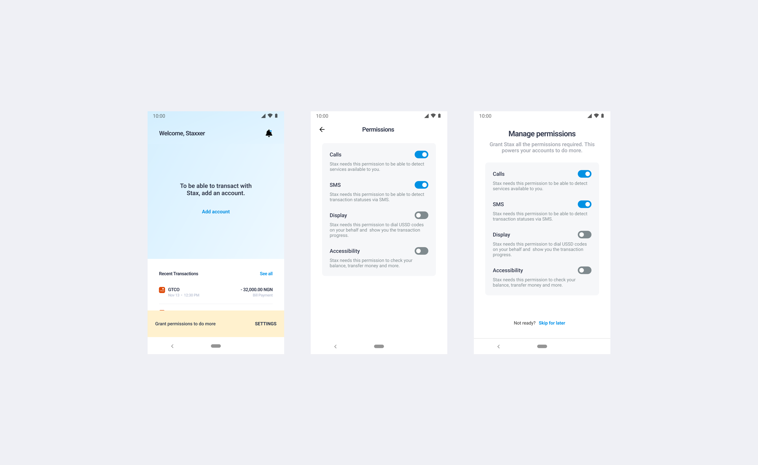
Create a permissions page for users to always have access to their permissions anytime they wanted to; this also helped as some users required the permissions to be turned off due to privacy.
Created a notification on the screen when you signin or are inactive for a while that informs the user that they can do more if they open up more permissions.
Our friend and foe, Mr Time..
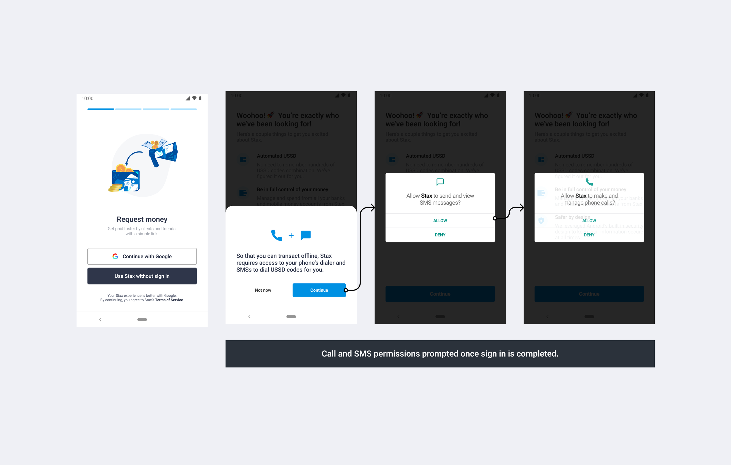
Due to time constraints and the increasing rate of user churn, we were unable to build a new design system and implement a new UI in time. As a result, I worked with the team to come up with a solution that would enable us to quickly ship both options and test them out using the existing components. Here are some screenshots from it. Also, after a month’s worth of testing, iteration 1 had the least amount of churn and we made that the main onboarding experience.
Key things to note:
I simplified the language used in the permission request flow to make it easier for users to understand.
I added steppers along with GIFs to the display and accessibility permission explainers to help the user expect a similar but more complicated process on the accessibility permission.
I changed the flow of the permissions to come up exactly when needed at the point where the SIM would need to be displayed and at the point of a transaction.
Results & takeaways
Our user-centered approach and targeted updates to the onboarding and permissions process yielded significant improvements to the user experience and trust in the Stax app. Key results included:
Activation rate (first open to first transaction) increased from 18% to 30%.
Day 1 & Week 1 retention increased from 8% to 24%.
Month 1 retention increased from 4% to 15%.
By maintaining constant monitoring and addressing user feedback, we ensured that the improved metrics remained consistent over time.
Challenges and learnings
Throughout the project, we faced challenges such as addressing diverse user needs and overcoming technical constraints. Key learnings from addressing these challenges included:
Engaging users early in the process and iterating based on their feedback is crucial to understanding their needs and expectations.
Collaboration between design, product, and marketing teams is essential to align project goals and develop a cohesive user experience.
Regular monitoring and evaluation of the implemented changes help identify areas for further improvement and ensure long-term success.
Final thoughts…
While some aspects of the project (even building a proper v2 with a dark mode) were left incomplete due to time constraints and team workload, the overall experience of working collaboratively with marketing and product teams was highly valuable. The insights gained from this project can be applied to future endeavors, emphasizing the importance of a user-centered design process and effective teamwork.


