Payments people can complete with confidence.
Kora, formerly Korapay, is B2B payments infrastructure for African businesses. I spent three years there as a product designer. This case study focuses on two projects I led: improving a bank-transfer checkout that was completing only 38% of its transactions, and rebuilding the merchant dashboard businesses use to manage pay-ins, payouts, settlements and balances.
Kora helps African businesses collect and move money: bank transfer, cards, checkout, and a merchant dashboard to manage it all. It competes with Paystack and Flutterwave, so the bar for trust and ease is high. I designed across that surface as the company grew from an early startup into profitable infrastructure.
Kora's checkout accepted bank transfers only for six months. Over a million transactions had run through it, and only 38% completed. The team wanted to add card payments, but adding a method to a flow that was already failing would just spread the problem. First I had to fix why people were dropping off. We had little time and few resources, but freedom to experiment.
What the data showed
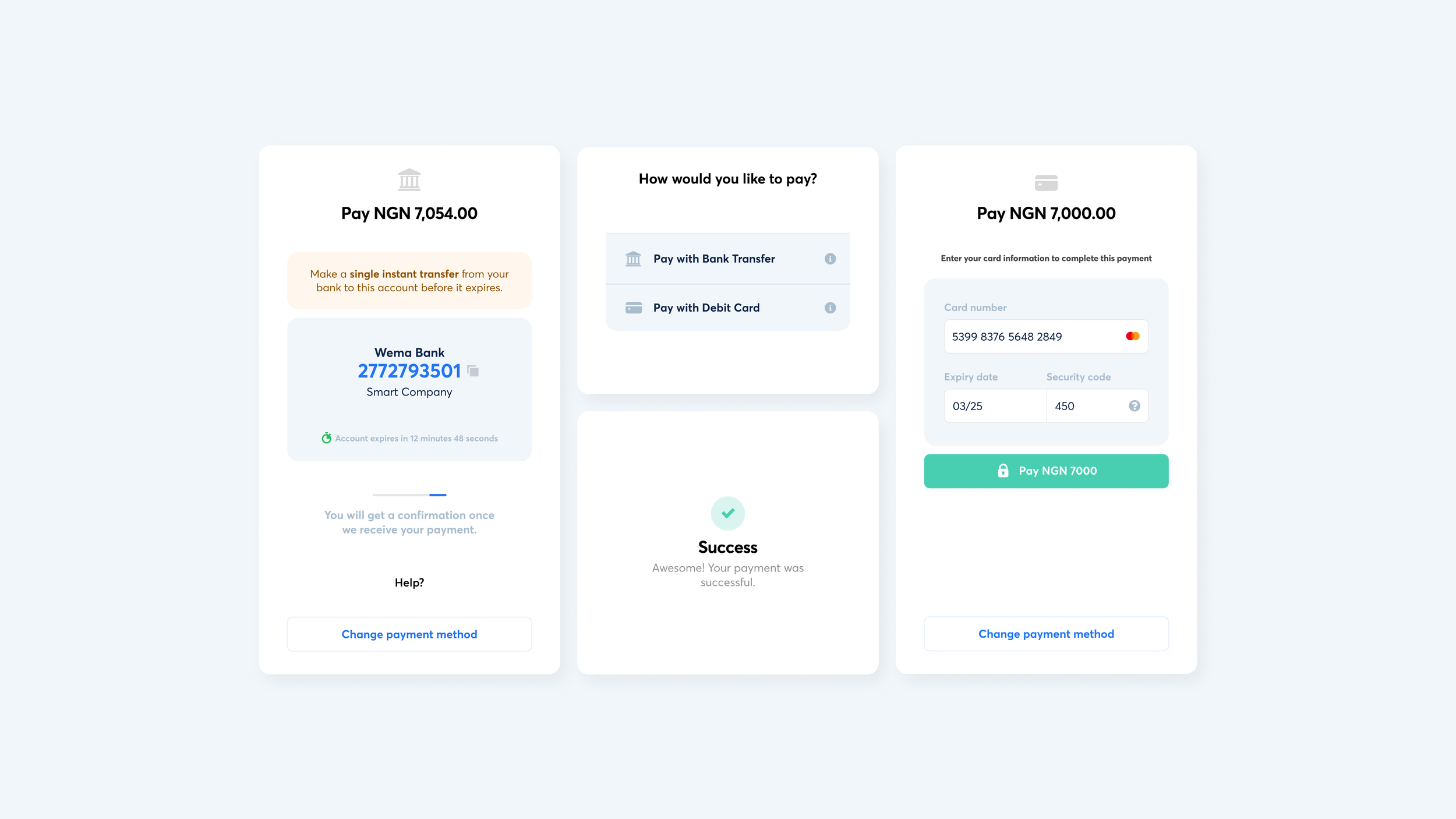
From Mixpanel and support tickets, two things stood out. People clicked "I have paid" and got stuck, because the payment-status check clashed with other systems and needed manual resolution instead of resolving on its own. And people missed the details that mattered: how long they had before the account expired, and that they needed to send one single transfer, not several. I mapped the paths in FigJam to see every way a payment could go right or wrong.
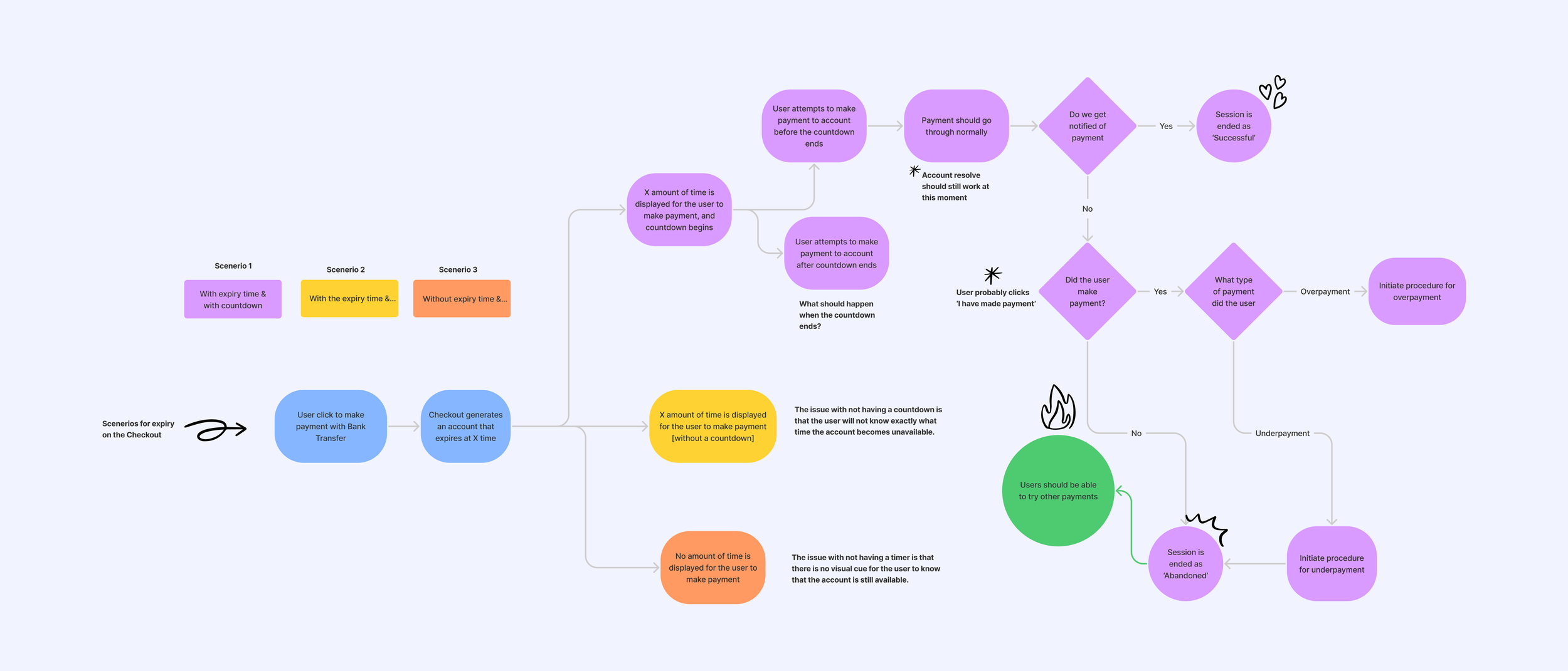
The core question was what to do with the "I have paid" confirmation button. It was the source of the stuck transactions, but it was also the moment people felt in control. Working with Nnamdi, I narrowed it to two flows and tested both with colleagues and a few real customers.
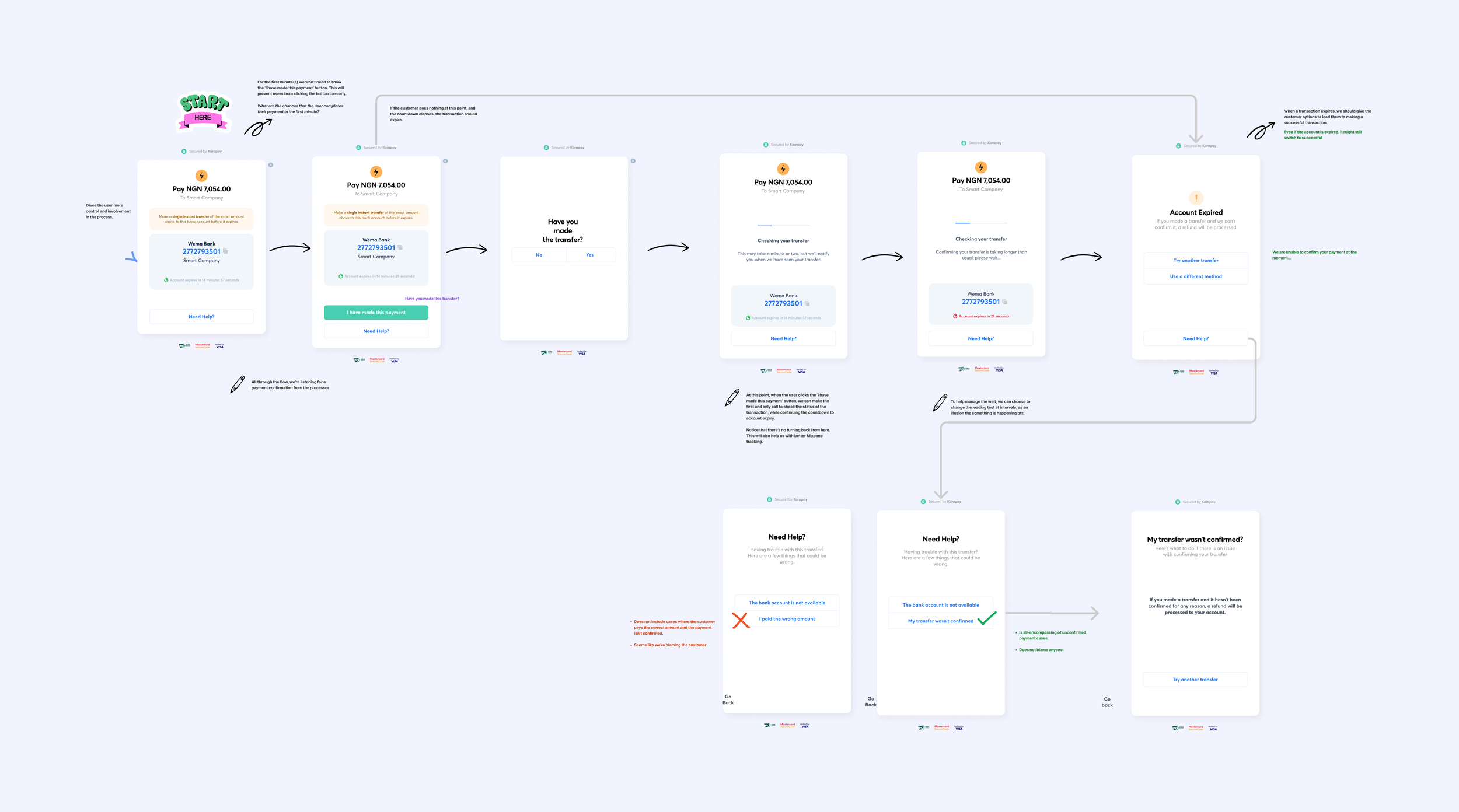
What I chose, and what I gave up. Removing the button would have made the flow much shorter, but it also risked making people feel passive at the exact moment they were sending money they couldn't easily get back. Keeping it added steps, but it gave a stronger sense of control and room for clearer checks, alerts and recovery states. We gathered preference signals from colleagues and a small group of customers, and the confirmation flow won. I traded some speed for trust, which for a high-stakes payment was the right call. I also kept it incremental, not a big-bang redesign: clearer methods, a readable expiry section, small type and spacing fixes. A million transactions were already running through the old flow, and a hard reset would have confused the people mid-payment.
The new checkout makes the state legible at every step: what you owe, how to pay, how long you have, and whether it worked. Pending, success and failure are all designed as real moments, because in African payments the in-between states are common and stressful. Prototyping carried a lot of this, with a loader that watches for a pending transfer and resolves to success, so people no longer had to guess whether their money arrived.
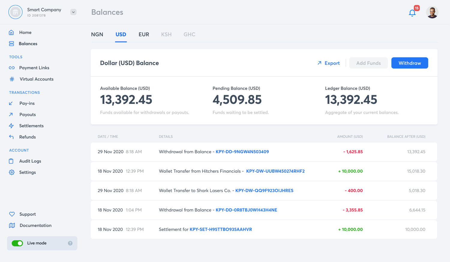
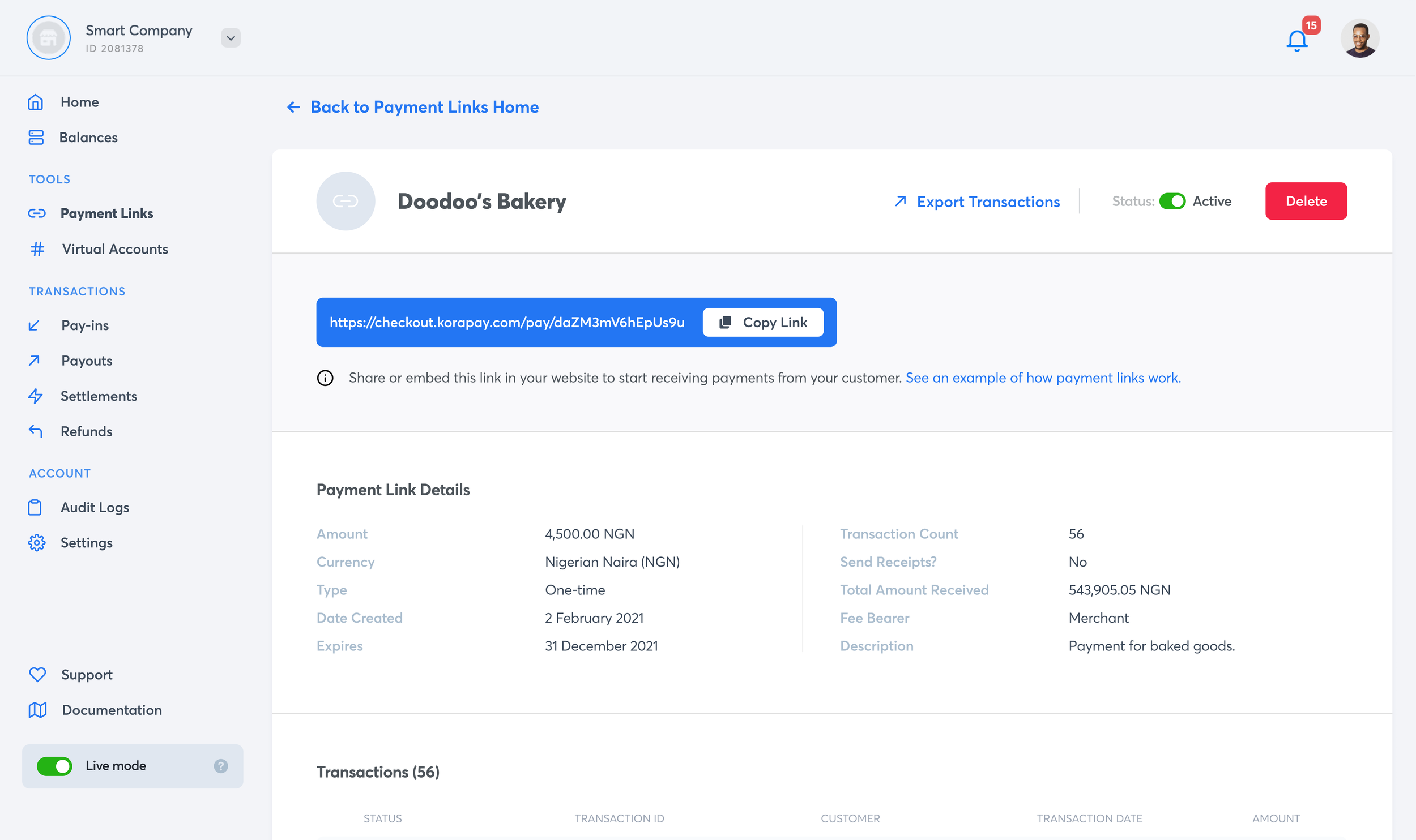
In parallel I led the merchant dashboard, the tool thousands of businesses use to track payins, payouts, settlements and balances. Against Paystack and Flutterwave, the deciding factor for a new merchant is how fast they can get set up and running. So I started with a workshop and merchant interviews across business sizes, from an individual seller to Binance, to rebuild the portal around the merchant instead of the other way round.

The hard design problem was breadth. A small merchant needed the dashboard to feel simple and approachable; a large business needed power, virtual accounts, balances across currencies, payment links, settlements and transaction records. I treated it as a visibility product: make the most important financial state easy to find first, while keeping the deeper operational tools close for advanced merchants. The result was a restrained interface where the content leads, not the container. That balance, small versus large, was the hardest part of the project.
In its first year the rebuilt dashboard saw about 35% more merchant signups, 40K+ new merchants. Onboarding speed, sales and a growing market all moved that number too, so I hold it as team context rather than a design-owned result.
To be precise about attribution: the backend fix recovered the biggest hard-failure bucket and card payments widened who could complete at all, so the 38-to-59% lift was a team outcome. The part I can point to as mine is narrower and measured, the confusion-driven failures my clarity layer owned. After the state, expiry and single-transfer changes shipped, payment-instruction support tickets fell from 4.2 to 2.4 per 1,000 checkouts, about 43%, and split-transfer retry errors dropped from roughly 8% to 5%. That is the number I would defend as design's.
Kora became profitable B2B infrastructure. Across both projects the throughline was trust. The checkout, the states, and the dashboard all had to tell a business the same thing: your money is safe here, and you can see exactly what it is doing.
We chose the confirmation flow from a preference poll. If I ran it again I would A/B test the two flows live and measure the click reduction against real completion, rather than trust what people said they preferred. Preference and behavior are not the same thing, and with money on the line the difference matters.
Kora is also where I learned that fintech design is trust design, that trust is built across every surface a user touches, and that when a million people already depend on a flow, incremental beats big-bang almost every time.